
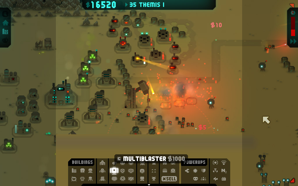
We’re going to be making a few changes to the buildings/powerups panel. Here’s the current HUD….

First of all, and by popular demand, we’re going to add a sell button. Unfortunately there’s not enough room to squeeze it into that bottom panel, as that’s about as wide as it will go on a vertical display – the max width when vertical is shown by the dotted lines.
We could make the icons smaller to squeeze it in, but some people have also commented on the icons being too small to tell apart easily as it is, so that’s something else that would be good to address as well – magnification on hover being one suggestion.
There also needs to be a way to be able to hide the buildings/powerups panel, as it prevents building along that bottom edge.
So, 2 different designs after the jump…
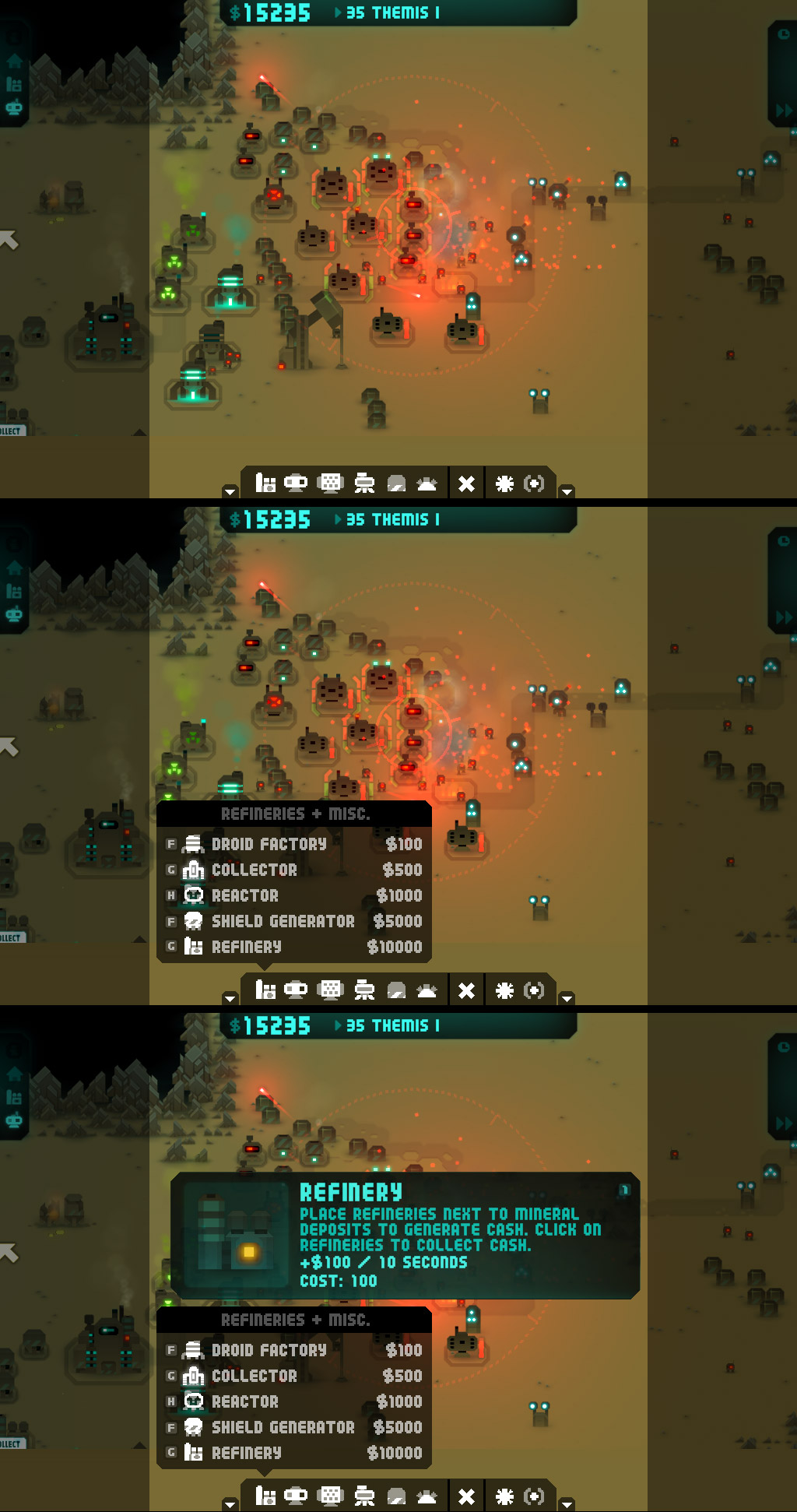
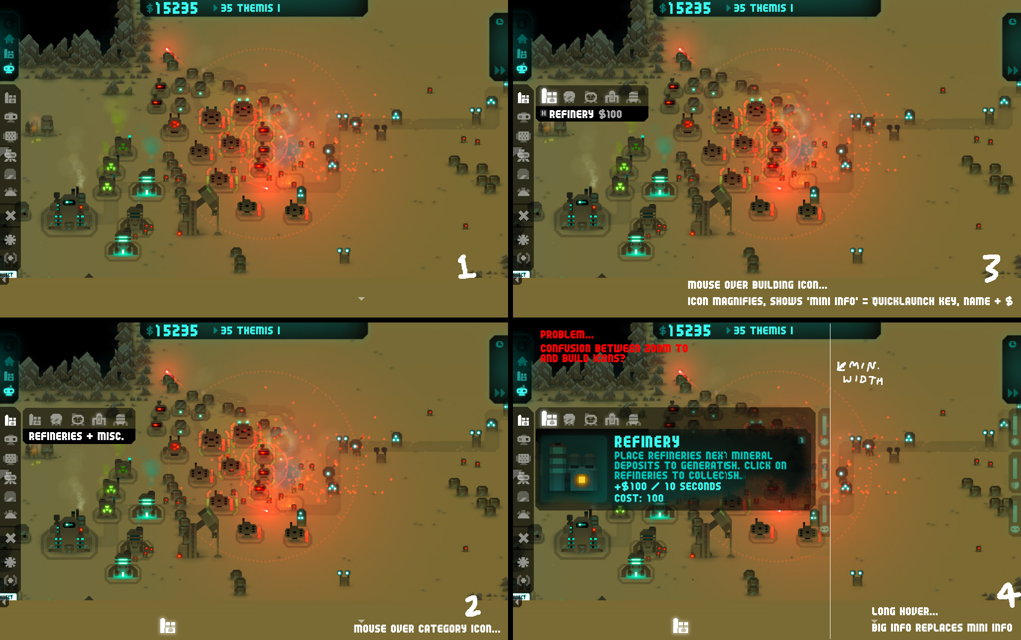
Solution number 1
Make 3 rows for icons rather than 2, and add a thin ‘hide’ button on the bottom edge. The increase in rows gives quite a lot of room to play with, so I’ve spaced out the icons more, and increased their size by 10%. …

… which means there’s enough space around the icons to be able to magnify them on a hover …

The extended info panel stays pretty much the same …

Pros and cons – the icons are the same as with the current design. The icons, though a tad larger, are still pretty small, and the panel takes up quite a lot of space, especially in extended info mode. The lack of labels on the different building categories may be initially confusing for new players, but on the plus side everything is visible and one click away – making it fast to select stuff, once you know what’s what. Also, less work for me to do on changes 🙂
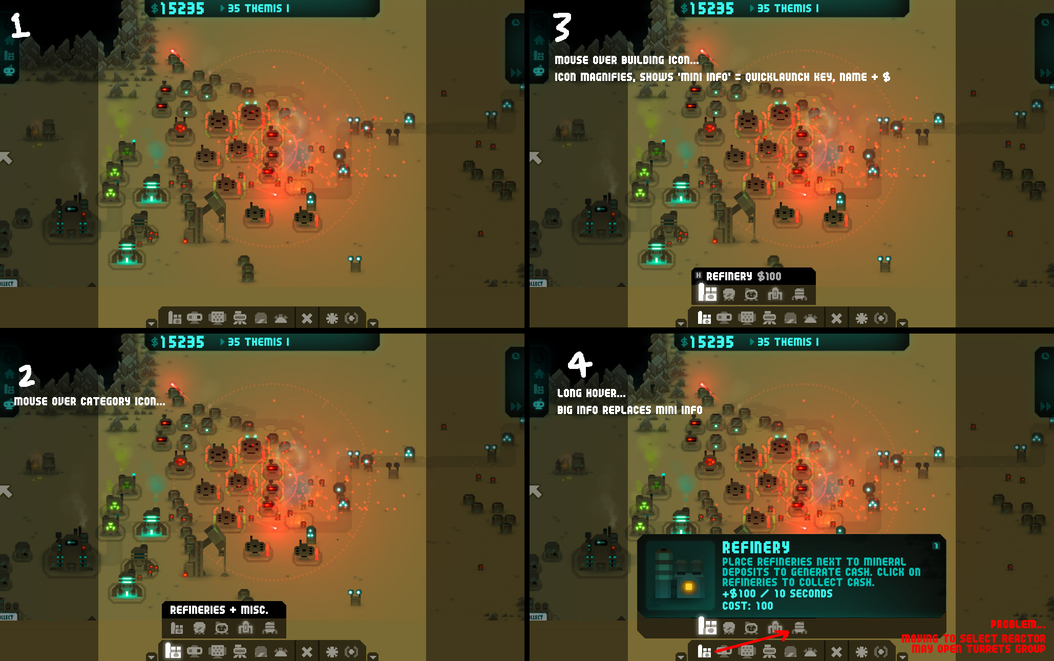
Solution number 2
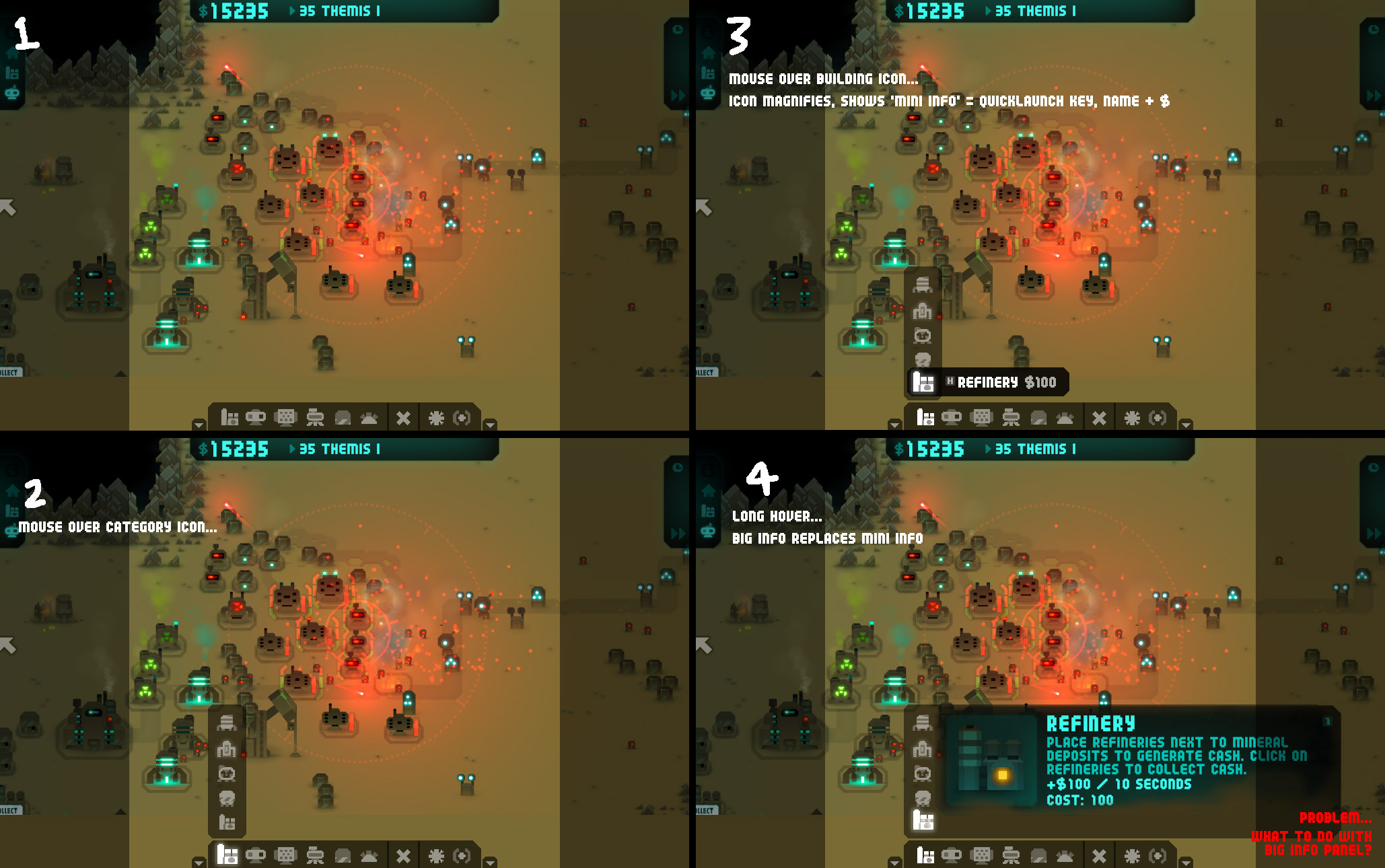
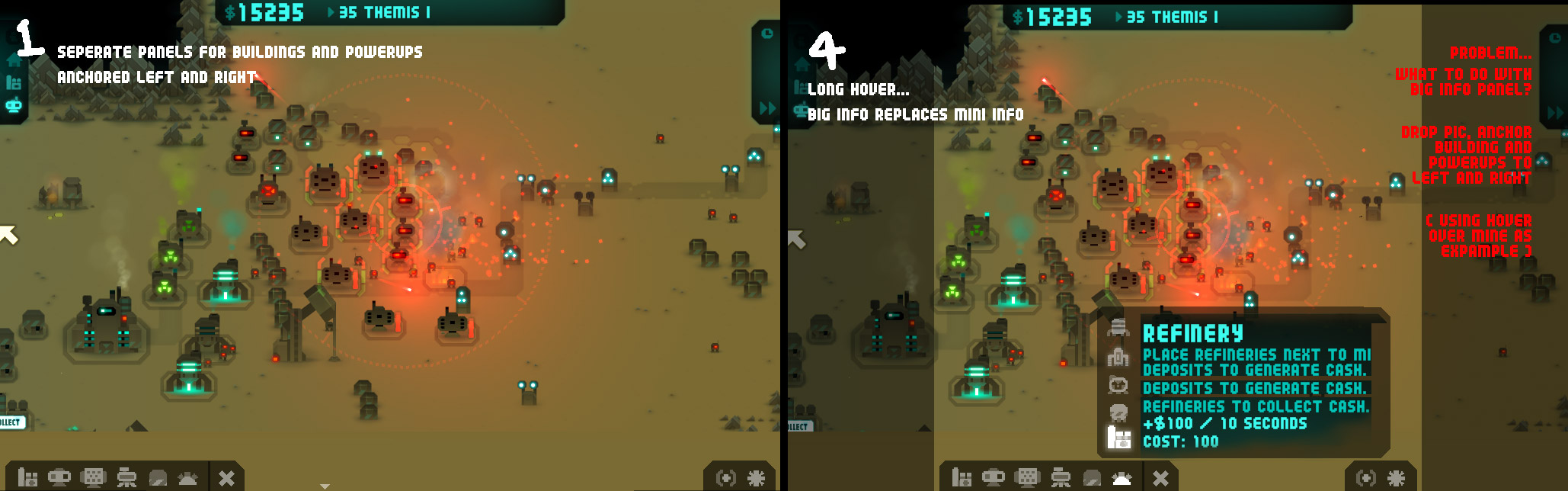
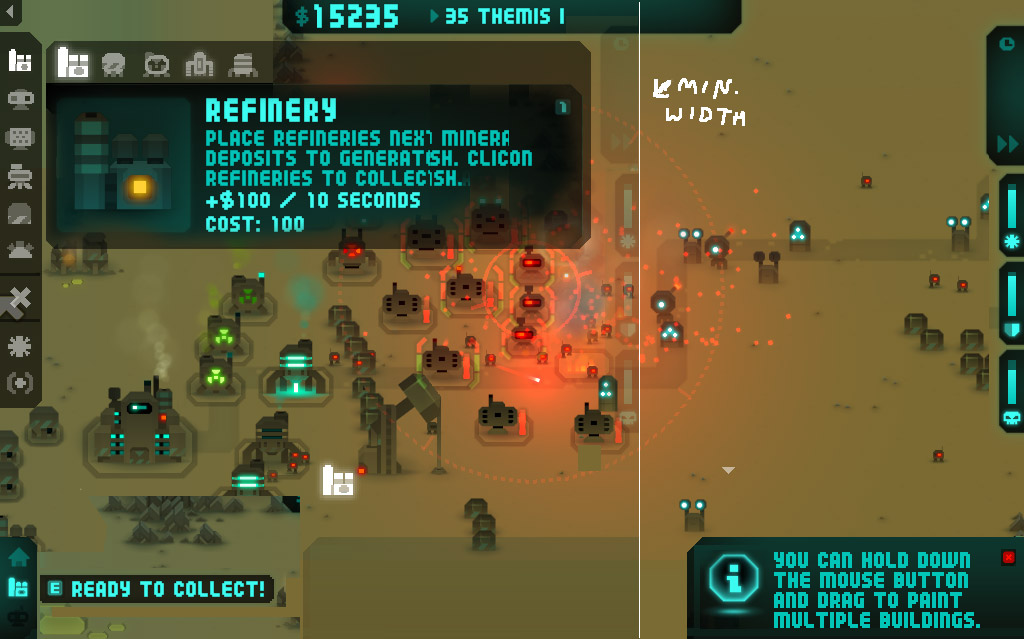
Rather than showing everything on screen all the time, only show each category of building/powerup as an icon. A hide button is in the top-left corner, though as the panel is now smaller there would be less need to use it. The icons can also be made bigger…

Another panel appears when the category icon is hovered over, which shows the category title …

Hovering over a building or icon magnifies it too, and shows quicklaunch key, name and price underneath …

… and the extended info section opens up underneath …

Pros and cons – All the icons can be make significantly larger, and yet the whole thing takes up less space. Splitting the categories up like this and showing a category title may make things easier to locate in general and may be easier to get to grips with for new players. On the down side, you’re going to need to do ‘move to cat. icon > move to building icon > click’ rather than ‘move to building icon > click’. And also it’s more work for me.
So… any thoughts on these ideas, or any other solutions you can think of?
Here’s some more images showing the progression to come to solution 2…
Woop, an update XD
How about simply pressing del to sell a building? Or hold down del and you can sell several buildings.
If you put the sell button up on the side instead of on the tool bar it’ll be fine as selling is different from all the other buttons.
P.S. I like V3-01
Is there a way to turn off tool tips? Those big info boxes always get in the way during a big fight XD
Looks great! I especially liked 01, 05, and 09. Maybe you could have a choice between HUDs in the options menu. Because going through categories could get slightly irritating, and use up precious seconds when you get to later levels!
Yep, this is the big problem with the solution no.2 style categories design. Perhaps I could add a toggle button so you could switch between the 2 designs somehow – will have to have a think about that.
Ok my thoughts on all of them…
3-01 sorta unorganized, and I would not pay that much for a refinery ;D I think it could be bether if the menu with the selections turned into the big info, and have a back button on it.
3-02 you allready stated a problem with it, and the problem will bug me.
3-03 One of my favs, if you could make the big info box smaller it would be perfect, maby when scrolling on the other ones, when the big window comes up the selections get pushed to the back instead of staying over their menu. Ill make a picture if needed.
3-04 Needs tweeking, make the menues moveable, and make the menus expand into 2 rows of all the icons, like the classic, also the picture you posted for it is incomplete.
3-05 Another nice one, could be promising except for the problem, could be the same as 3-04 in a different spot.
3-06 Looks just like a meeningless picture to me please speculate.
3-07 Same as number 3-06
3-08 Is this just showing the concept of 3 rows?
3-09 Fighting 3-03 as my favorite, maby make it moveable to the side and the top
Are you going to have options for different styles like this? I dont know if I like the classic (with hiding added) 3-03 or 3-09 bether! Also, did you code them in game or edit the pictures? I see the monsters are in different places each picture.
Last question I promise, will you add the option to pause the game when selecting a building?
These are just mockups – muck quicker than all the XML fiddling I have to do get GUI stuff working.
Can’t say about the pause thing – that’s Cas’ department.
More answers below… 🙂
I am not seeing any of the large images(first 8). I tried it in Firefox and Chrome.
Me too. Broken uploads?
Bah – was working last night fine – but after clearing my cache it looks like all the images have actually been deleted – re-uploading now…
I prefer 9 (solution 1), the other solutions get overly complicated.
Also, I think the detailed descriptions of buildings aren’t necessary during a level, name and price should be enough. The extended info takes up too much space at the moment.
The detailed descriptions of buildings along with their stats could be shown in the science lab together with the description of the tech that unlocks them. Right now the stats are shown only once, when you research the tech. I think they should be accessible somewhere.
So… does anyone want to see the big extended info panel during the game, or is it just annoying?
Would it be better to have access to building info during the level interludes, or be able to pause the game and look at more detailed building stats like the pages you see when you research stuff?
I’m liking the suggestions of being able to choose which style to use – and perhaps being able to switch in-game rather than the options screen would be better, though not sure if this will be possible. If the extended info panel is dropped then I could use a design more like v3-03, with the buttons down at the bottom and have some kind of toggle… will do some more mockups this afternoon.
For the menu bar, I prefer the smaller bar at the bottom the way it is now. Maybe you could make the entire interface pop-up or activate on TAB or backtick? That would be a sweet option. Also using delete to sell buildings would’t be a bad thing if you didn’t want to add a button.
Also, what will be the penalty for selling buildings? The player should get less money back than they would normally at the end of the match. Otherwise you will get players selling their entire bases before every level to get additional dough.
When assigning keys for the game, make sure the left hand can do just about everything (for us righties.) This will be important for survival mode, especially if you are vindictive of us players and decide to disable pausing except for timed breaks between every 10 waves. =)
Also, the in-game hints/pop-up info are nice but realistically it would be good to have that information OUTSIDE the active game, maybe by moving it to the Research screen? (add little ?’s in the corner for already purchased items to see their abilities) and also you could put “unlocked/obtained power ups” as well.
For me, the ingame pop-ups are one more thing to frustrate me when I’m in the middle of a battle clicking things like mad. The last thing I want is a pop-up reminding me to pick up powerups when I’m trying to pick up the powerup.
***
One question for design, will restarting the game with unlocked powerup’s be an option in the final release? if so I think the new balance is good.I didn’t realize there would be 50 levels in the game. I thought it would end with Saturn Part 1. It would be cool to record high scores online ONLY for those players who:
A. Don’t choose easier maps.
B. Don’t restarted the game.
Also, thanks for making the super-weapons actual super weapons. Especially the missile blowing up my own base along with concrete barriers and anything else has changed how I use that weapon. Lasers are kick ass too but I’m not sure how I’ll use the disrupter since its hard to give it 4 reactors, 4 batteries, 4 scanners, 4 cooling towers, an autoloader and STILL have one side of it near the enemy…
I think you need to increase the detection range a little, either by making scanners irrelevant (because it can only kill stuff thats near it anyway, so why not have scanners do nothing like they do for capacitors) or manual fire =)
Also, what do reactors do for missiles/lasers? More damage? Larger damage radius?
Cheers! Keep up the good work!
Chaz, the top HUD image is broken still 🙂
We can stick an option in to turn off the big popup info thing very easily. Toggling GUIs in-game is also relatively no more difficult than doing it from the options screen, but I can’t really see anyone wanting to actually do that whilst playing a game. Seeing as we’re a bit strapped for time we should probably choose one for now and stick to it and make it as good as it’s going to get.
sorted
My vote goes for the last panel, the one displaying all incons with the categories. I am always lost for searching the building I want to build because right now they are not sorted in an intuitive way (for me).
How about using the solution with the left menu bar and associating keyboard numbers with each one of them.
example: If player press 3 then5 he will select category 3, item 5.
To make it easier if it is possible just put category numbers like
1 – walls
2 – mines
3 – blasters
4 – blabla
5
6
then once the category extended, number the buildings, example:
1. concrete wall 2. metal wall 3. litium wall
Miight be even faster doing so rather than moving the mouse to make a selection
Although I’ve not played RotT yet due to my sound issues I much prefer solution 1. Solution 1 looks clear, quick and easy. It also keeps the screen symmetrical which is nice… :-/
Solution 2 sounds like a good idea but to me it seems like another layer to navigate through which based on what I’ve read could be quite problematic when things start to get a bit hectic.
Being able to toggle the full info pane from the options would be a good trade-off between newer players wanting to learn what’s what and veterans wanting a leaner GUI. The full info pane fits in nice and tidily with solution 1. I presume it will be a long hover as well to bring that up?
One thing you shouldn’t disregard is that the white space around the icons also effectively enlarges them, providing focus.
Cascading menus both hide information and requires more clicks.
A third way would be to only show what you can build… and color coding the latest researched item (until the next level, when the player is familiar with it and the new menu layout).
The big extended top info panel is a nice addition, however when you realise that you have to click on it to close it it becomes a major annoyanes. Usually when it appears I am so overwhelmed that I just leave it be although it impairs me visually.
If you can just keep it on 7 seconds or so and close it automatically it would be perfect.
Good idea, I’ll put in a timeout so it goes away. And a delay between them appearing, if they queue up.
Solution 1 looks the best to me (I would have said that earlier, but there weren’t screen shots for it).
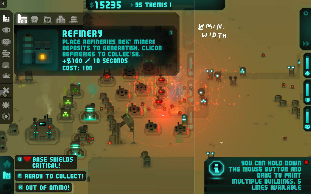
Will we be able to sell things by holding down the mouse button and dragging like the way you can reload multiple blasters and refineries to decrease clicking?
That sounds dangerous!
Sell mode is a click-and-drag operation. So be careful with it 😉 It’s also implemented with the middle mouse button so you can use that instead. Probably best, if you’ve got a middle button.
Can we redefine keys in options? Because middle mouse is hard to press on my mouse wheel but I do have 2 other side buttons on there that I like to use. Would also be good to let my re-assign building short cuts
Don’t think we have the time to implement key bindings stuff – it’s a lot of work for not much gain 🙁
Actually any mouse button other than left or right should work, though strangely, JInput, our input library, won’t accept anything other than the middle button. I’ll have to look into that.
Hey Cas,
For HUD design I definitely prefer everything on the screen at once, although…maybe you could move power-ups to the right side separate from buildings and move the monster-timer to the bottom left?
Also, for HUDS, one program you might want to check out is Art Rage. I have it for PC and Mac and it has a very cool pop-up interface. Might be worth taking a 5-minute look at to give you a few ideas of how things are organized…
http://www.artrage.com/
Would still really like a tab-to-show-interface option though. Maybe rather than having it ‘pop-up’ you could have it go transparent like the ghosts?
I.E. When you select a building, the entire interface goes transparent until the selected option is canceled using the right-mouse-button.
This would keep the entire interface on the screen but would move it out of the way when you are trying to build something.
Just a few more ideas…
Cheers and don’t forget to tilt one back after reading this, wouldn’t want your blood-alcohol level to get too low…
Jonathan
Hi,
let me add my two cents here:
1 Looks really unorganised. and a little packed, a no go for me.
2 Worth a try, but probably fails because of the mentioned problem. 3 Is a better option.
3 Great, you broke it down in dimensions here, that really does make sense: choose vertically, move horizontally, read vertically. preferred slim style from my side.
4 Looks clashed, and the separation does not make sense to me + adds another screen area to take care of.
5 I’m strictly against putting everything on the left side, when areas of the screen have designated usages its much more intuitive, why combining info and action? That’s confusing.
6 As five + info at the bottom is counter-intuitive (overall for games), the first thing you read should be it.
7 As six.
8 Is that an option? Looks to plain to quickly find what you’re looking for.
9 Very powerful in my opinion, because reachable and well sorted, maybe combine with 3 as a slim option?
Another Idea could be to colour code the Icons: red hues for weapons, but different reds for each of it. Not to saturated but recognisable different.
All right, keep up the good work!
X-Site
I like solution number one, though 2 is really fancy. There should be just a way to hide the menu, for example by pressing “tab”. For most buildings I use the keyboard shortcut anyway so I’m fine with quite anything.
Also I think selling buildings should not give you as much money, as you would get in the end by automatic recycling. Maybe 80% or so.
Selling buildings gives you 40% of the purchase price, factored by any damage the building has taken, rounded to the nearest $10. There will be a shortcut key to hide all the buttons (currently this is Insert). Delete puts it into Sell mode.
Immortal Defense had a selling system that made the value of the towers diminish with age so that if you misplaced something you could sell it straight away with no penalty but conversely at the end of a level the oldest towers were worth bugger all which discouraged you from mass selling for a quick buck. It also helped that when a level was completed it told you how many enemies each tower had destroyed which was important for measuring the effectiveness of certain tower combinations and tactics, again discouraging you from mass selling. I’m surprised no other games really picked up on these features.