Thanks for all the feedback on the HUD changes – it seemed opinion was split between versions 1 and 2, but with the majority in favour of version 1, so I’ve gone ahead and sorted all the graphics and XML for that.
It may be possible to add some option to choose between the two at a later date, and I’ve arranged the various buildings so that they could potentially open up from category icons in little panels of 1×3 or 2×3 building icons… but as its taken 2 and a half days of fiddling to sort the HUD out so far I don’t think I’ll have time to do that before the next release which we have planned for Sunday.
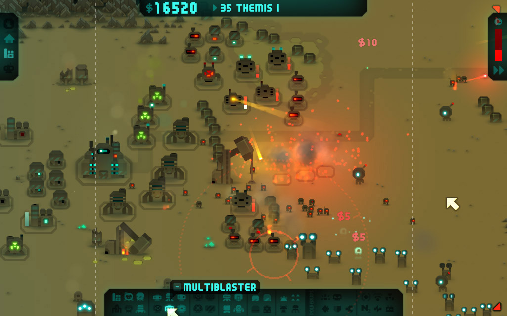
This is how it was looking before…
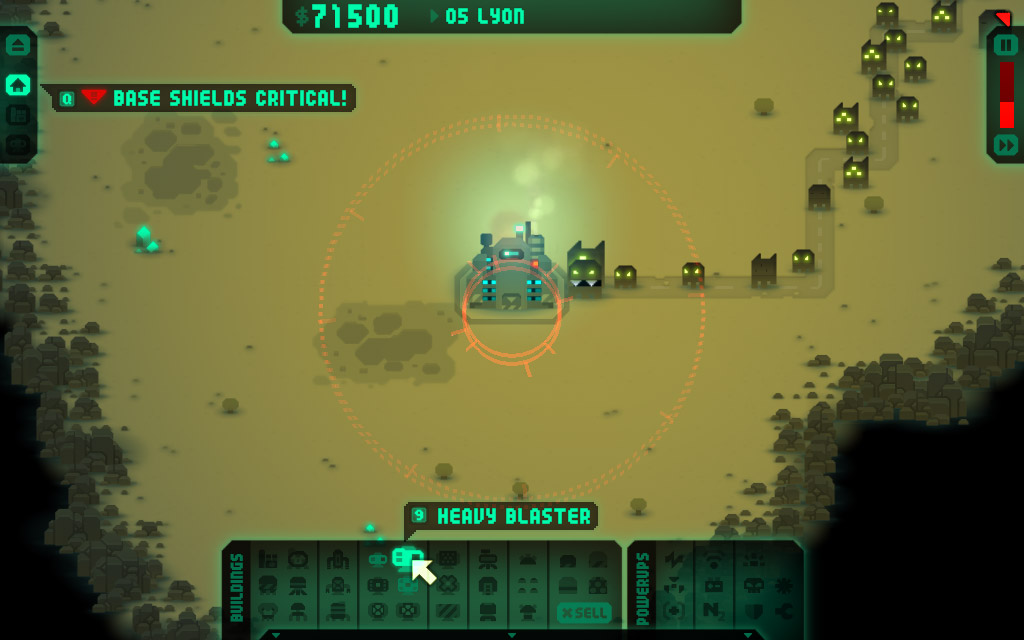
… and here’s how it looks now….
Changes made…
- Changed from 2 rows to 3 for buildings and powerups, to make space for sell button and increased icon size
- Added sell button, which changes to a red cancel button when in sell mode
- Replaced build mode cancel button with new one
- Increased building and powerup icon size
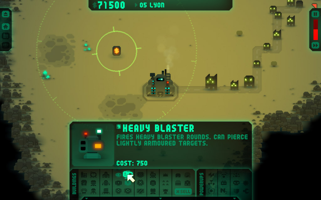
- Added zoom effect on hover to all the icons
- Added ‘buildings’ label in addition to the existing ‘powerups’ label, and updated style
- more space between icons and categories of buildings and powerups, with more distinct separating lines, and added gap between buildings and powerups
- added show/hide button on the bottom edge
- restyled the various buttons in the top left and right panels
- added buttons for pause and for the existing ‘esc’ menu, in new button style
- made the shortcut keys consistently a bit brighter – previously it was a bit buggy
- fixed a mistake in exporting a few of the shortcut key graphics, which meant four of them were mixed up
- made the extended info panel a tad tighter
- moved extended info shortcut key from top right to top left, so it’s now before the building title like in the tooltips
We’ll add options to suppress tooltips and the extended info panel, and make the extended info hide immediately when you move the mouse away from the bottom panel, rather than hanging around for a second or two as it does now.
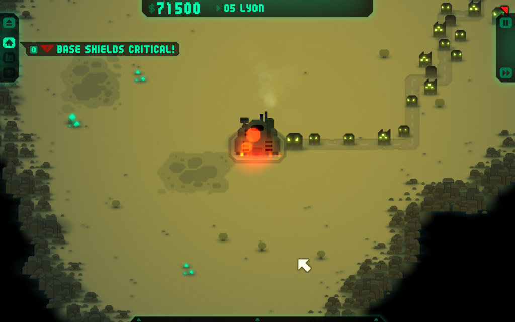
Here’s with the panel hidden, activated by clicking on the long thin button on the bottom edge, or currently by pressing the insert key (though spacebar would be better perhaps – don’t think that’s being used for anything at the mo)…
Next post coming up soon – the research screen


Looks neat, but I can’t help but feel the “power-ups” tab should have a separate button to hide them.
BTW: Any official decisions on how much money players get for selling buildings?
Can they get 100% back if the building has been untouched? Or at least within 10 seconds in case a player places something by accident during the build phase?
Fairly sure we’re going to stick with 40% of purchase price attenuated by damage and rounded to nearest $50 (which is what automatically happens to all the buildings at the end of the level anyway – that’s the “building recycling”) but I might get all generous and have a 10 second timer to allow “undos” 🙂
Note that you won’t be able to sell barricades and mines and they’re not recycled at the end either.
I seem to be initially averse to the show/hide button at the bottom–would it work to just have the build window open when your cursor isn’t in placement/sell mode? That is to say, to open the window, all you have to do is right click on empty space and it pops up–and it goes away again once an option is selected?
Aside from me telling you how to do your job (sorry, I hate it when people do that to me), I wanted to say good effort–this stuff looks great and gets better every release. Keep it up, man!
That’d kind of work – but would mean you’d have to cancel building each time if you were building a few different types in a row, rather than being able to continually pick new ones off the panel as you go… if that makes sense 🙂
We also need to make the game possible to play with just one button – so things can use RMB, but the game can’t rely on it.
Yeah, that’s pretty solid reasoning–I can’t argue with that. Carry on, then! 🙂
Looking tight! Those headings really help separate the buildings from the power-ups and I”m glad the info pane made the cut as well. Good work.
Looks excellent! Very good work! 🙂
On a somewhat related subject, the autoloader hotkey doesn’t work for me. I think all the others work.
Keep up the good work, I’m looking forward to the upcoming release and new features.
Fixed in the forthcoming release (Sunday).