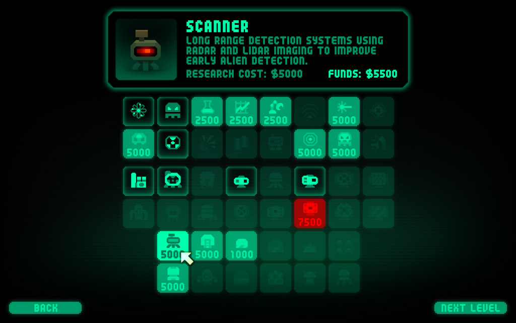
Next up for GUI tweaking is the research screen, which currently looks like this…
There’s 2 major changes to make that people have requested:
- to be able to view more complete info and stats of already researched items
- some way to tell what research item leads to what, rather than effectively having to guess
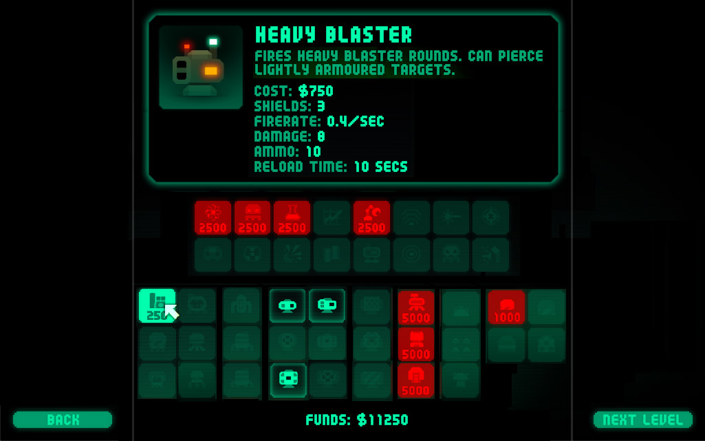
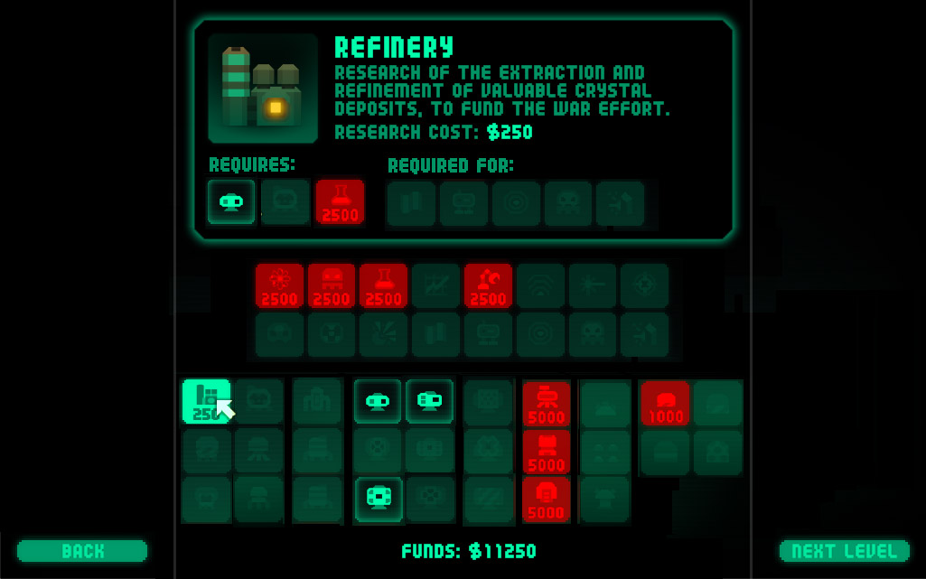
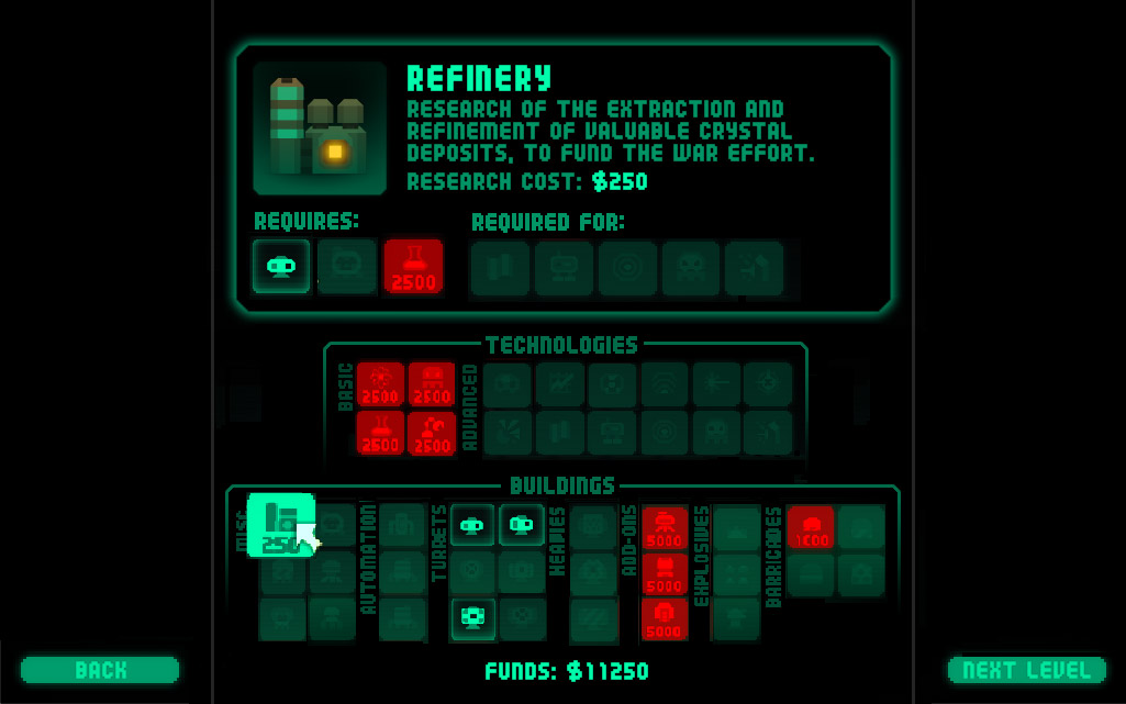
The following images are first thoughts, and quick mockups – I know they don’t make a lot of sense as to what’s being hovered on, refineries don’t lead on to robotics etc. 🙂 …
First of all, to get those stats in, the info box is going to have to be bigger which means the tech icons are going to have to be smaller. The building icons also should be arranged in the same order as they are in the in-game HUD, so they now need to be in three rows rather than two. With smaller icons though we can now fit them all on one line.
The tech tree is pretty complex – here’s that lovely tech-tree graphic link again – so not easy to show. Increasing the size of that panel though could allow us to show a little info as to how things are linked up…
Decreasing the icon size a tad more (and using a zoom effect on hover like the new in-game HUD) would allow for categories of technologies and buildings to be shown, perhaps making things clearer (and help people understand the layout of the icons in-game too)…
As I say, first thoughts. Suggestions?
And also – should you be able to view details of things you can’t research yet? It would help you decide what to research, but would it take all the fun out of exploring the tech tree / unlocking new things?
UPDATE…
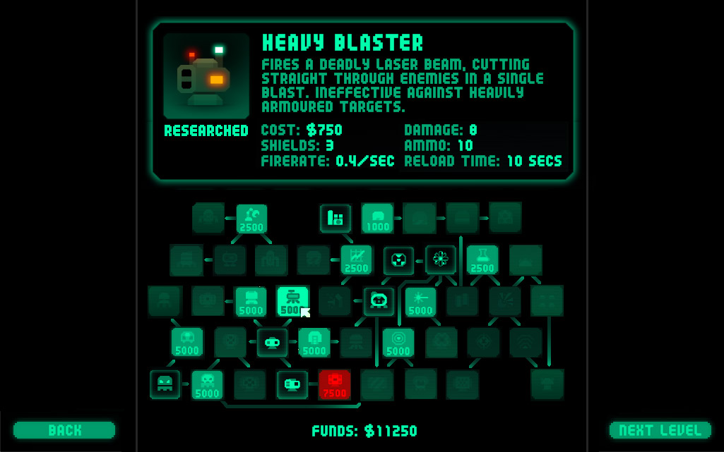
Or would it be better to show all the links like so…


I think that when the player wants to know what leads to what he should be able to first select the item he wants to know more about, then he can hover over the “required for” and “requires” items to know better than just the icons that what he gets when researching. Icons arent totally intuitive way of telling so it would be nice to be able to read them too. 🙂
How about highlighting the prereqs for a locked item on mouse hover in a different color? Same with what research item unlocks, if it isn’t locked. I understand that there are tems requiring more than one prereq, so you could use different colors or styles for items that stay locked after you unlock the hovered-over item because they have more than on prereq, and items that will become unlocked.
Suggestions for styles:
– a different color
– highlighting the edge of an icon
– pulsing the item in its current color
…just off the top of my head. 🙂
Btw, on a somewhat related note: How about being able to research more than one item at a time? Sometimes you may not have enough funds to research anything at all, which puts you at a *permanent* disadvantage. If it would be allowed to research more than one item per stage, then such disadvantages can be amended later on when you have more funds.
An alternative way to do this would be to award something like “research points” – you get one per stage, so getting lucky on the first few stages won’t allow people to unlock a bunch of stuff at once, making the game too easy. What do you think?
For an effective way to show what techs lead to which structures you can hover over a tech you’ve not got yet and it’ll highlight the resulting unlocks in a different colour. Pretty easy to understand, and for the discovery part you can hide other info of not unlocked stuff so all you have to go on is the shape of the icon.
I like the last screenshot.
The first one does only show the next step, whereas the last one is much more comprehensive.
And look at the bright side, now on the bottom right side you have two free slots for new techs :))))
Updated with tree-style layout showing links… better?
It has my vote!
Much worse, prefer the 2nd one
science discovery tree looks awesome.
All ways look good. I’d play it either way…
The tree-style looks the best to me.
I like either setup although the trees one is beautiful. Will save me having to exit the game to review the tech tree.
*thumbs up*
The tech tree is the most convenient one, however:
-it is uglier than the alternative just proposed above
-it does show all tech, which takes out indeed the fun of wandering around. Only “next step” tech should be shown
So my preference goes to the second alternative (middle picture).
Hey Cas,
Any chance you could implement both and a toggle switch at the bottom? One to show organization by item type, and the other to show the build tree?
Both worlds would really be…the best of both worlds…
Everything is possible 🙂 But not necessarily good value for money…
I think I probably like the third of the original three best, although the tree-style setup in the update is a close second. In terms of giving the player information, perhaps if selecting a technology you haven’t researched gives you just the cost, name, requires/required-fors, and a five or ten word basic description? (“improved armour-penetration for blaster turrets”, “increased ammunition capacity”, “can hit multiple targets simultaneously”, etc) That way the player has some idea what they’re getting, but there’s still some uncertainty as well.
(Here from the thread at Moonpod.)
Well, everyone’s a winner 🙂 – the code was a mess and needed a re-write, so it was easy enough to add a toggle button letting you switch between the two views.
Will post update of pics tmrw, once I’ve finished them off – off out for a beer now.
v2-03 is by far the most friendly; i would give v2-03 2 votes. the tech tree is ruthless and not at all cute.
I prefer either of the last two (technology vs buildings or the tree of madness). The tech vs. buildings layout is easy to use, and the tree of madness appeals to my gamer instinct to explore new things.
my vote goes out for No.3
🙂
Definitely the 2nd to last one – with categories – easy to use. I would like to see the ability to select first the upgrade then have a separate purchase button so you can, 1. mouse over other upgrades required to upgrade.
What about the ability to upgrade a tower/building to lvl2/3 AND with the ability to upgrade more than 1 thing as Luggage suggested.